Use this guide when the default themes are close, but not close enough. Each example below gives you a ready-to-paste set of custom CSS.
The fastest way is to copy one of the example themes, paste it into your favorite AI chat tool, and ask for adjustments like “Make it less round, primary color must be purple.”
Getting Started
- In Shopify admin, go to Online Store > Themes.
- Click Customize on the theme you want to edit.
- Open a product template.
- Add the PDP Warranty Selection block near your product form.
- Save your changes.
- Preview the product page and confirm warranty options appear where you expect.
Best quick-start path: choose one of the built-in themes first, then use Custom CSS variables only if you want more control.
Settings Reference
Theme
Choose one of the built-in presets. Default: Minimal.
- Minimal
- Ambar
- Dark
- Brand Colors
- Mint
- Ocean
- Caramel Latte
- Valentine
- Retro
Brand Colors pulls color values from your Shopify theme automatically. It reads theme variables such as --color-accent-1, --color-accent-2, --color-background, and --color-foreground. You do not need to paste those values into Custom CSS variables.
Roundness
Controls overall corner style for the widget. Default: 12px. This setting automatically feeds the widget’s card, option, coverage, and badge radius values.
Show ‘Most Popular’ badge
Shows or hides the Most Popular badge on options already marked as most popular in your warranty plan data. Default: enabled. If this toggle is on but no option is flagged as most popular, the badge will not appear.
Warranty description
Controls the descriptive text shown under the widget heading. Default: Extend your warranty and enjoy peace of mind with comprehensive coverage.
Show perks
Shows or hides the perks area for each option. Default: enabled. When enabled, customers can see the coverage details for selected plans.
Perks heading
Controls the heading text shown above the perks list. Default: What’s Covered:.
Perks list style
Controls how each perk is displayed. Default: Checkmarks.
- Checkmarks
- Dots
- Dashes
Show ‘Special Offer’ badge
Shows or hides the top badge on the widget header. Default: enabled.
Special Offer badge text
Controls the text shown inside the Special Offer badge. Default: Special Offer.
Custom CSS variables
Use this field for advanced styling. Enter semicolon-separated CSS variable declarations only. Full CSS blocks are not supported.
--cv-primary: #0f766e; --cv-border: #99f6e4; --cv-badge-special-bg: #0f766e;Important:
- Use only
--cv-*variables in this field. - Do not paste full CSS selectors or rule blocks.
- Unsupported names are ignored.
Example Customizations
Terracotta Warmth
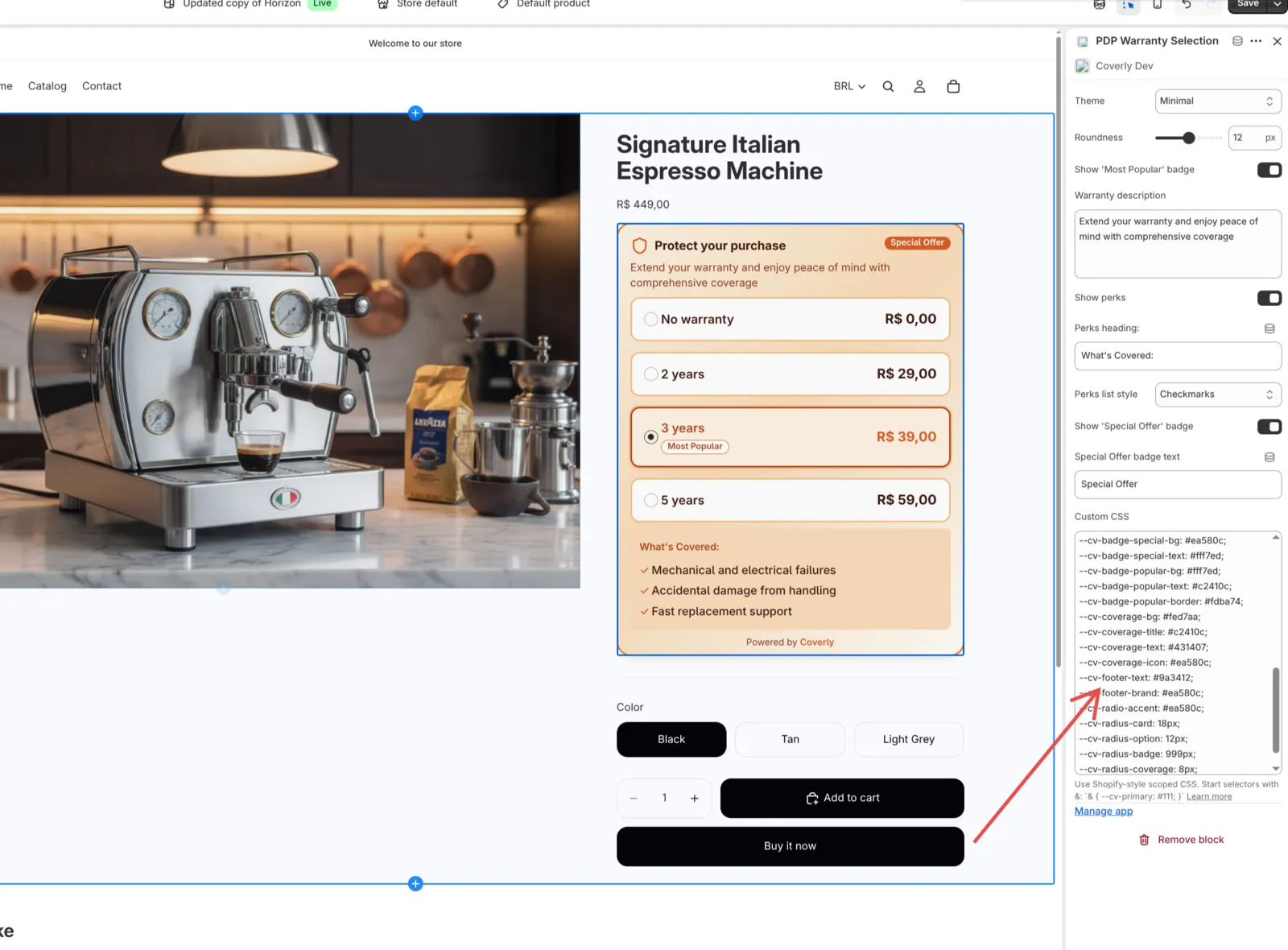
& {
  --cv-primary: #c2410c;
  --cv-border: #f97316;
  --cv-border-muted: #fdba74;
  --cv-background: #fffbf5;
  --cv-background-gradient: linear-gradient(180deg, #fffbf5 0%, #ffedd5 60%, #fed7aa 100%);
  --cv-card-shadow: 0 10px 18px -8px rgb(140 60 10 / 0.18), 0 4px 8px -6px rgb(140 60 10 / 0.1);
  --cv-icon: #ea580c;
  --cv-text: #431407;
  --cv-muted-text: #9a3412;
  --cv-option-hover-border: #fb923c;
  --cv-option-selected-bg: #ffedd5;
  --cv-option-selected-shadow: 0 0 0 2px #fdba74, 0 6px 10px -6px rgb(140 60 10 / 0.2);
  --cv-option-title: #431407;
  --cv-option-title-selected: #c2410c;
  --cv-price: #431407;
  --cv-price-selected: #ea580c;
  --cv-badge-special-bg: #ea580c;
  --cv-badge-special-text: #fff7ed;
  --cv-badge-popular-bg: #fff7ed;
  --cv-badge-popular-text: #c2410c;
  --cv-badge-popular-border: #fdba74;
  --cv-coverage-bg: #fed7aa;
  --cv-coverage-title: #c2410c;
  --cv-coverage-text: #431407;
  --cv-coverage-icon: #ea580c;
  --cv-footer-text: #9a3412;
  --cv-footer-brand: #ea580c;
  --cv-radio-accent: #ea580c;
  --cv-radius-card: 18px;
  --cv-radius-option: 12px;
  --cv-radius-badge: 999px;
  --cv-radius-coverage: 8px;
}
Conversion Pop
& {
  --cv-primary: #7c3aed;
  --cv-primary-contrast: #ffffff;
  --cv-border: #a78bfa;
  --cv-border-muted: #c4b5fd;
  --cv-background: #faf5ff;
  --cv-background-gradient: linear-gradient(160deg, #ede9fe 0%, #ddd6fe 40%, #f5f3ff 95%);
  --cv-card-shadow: 0 12px 20px -8px rgb(60 20 120 / 0.22), 0 4px 8px -6px rgb(60 20 120 / 0.12);
  --cv-icon: #7c3aed;
  --cv-text: #2e1065;
  --cv-muted-text: #5b21b6;
  --cv-option-hover-border: #a78bfa;
  --cv-option-selected-bg: #ede9fe;
  --cv-option-selected-shadow: 0 0 0 2px #c4b5fd, 0 6px 10px -6px rgb(60 20 120 / 0.2);
  --cv-option-title: #2e1065;
  --cv-option-title-selected: #6d28d9;
  --cv-price: #2e1065;
  --cv-price-selected: #7c3aed;
  --cv-badge-special-bg: #6d28d9;
  --cv-badge-special-text: #f5f3ff;
  --cv-badge-popular-bg: #ede9fe;
  --cv-badge-popular-text: #5b21b6;
  --cv-badge-popular-border: #c4b5fd;
  --cv-coverage-bg: #ddd6fe;
  --cv-coverage-title: #2e1065;
  --cv-coverage-text: #3b0764;
  --cv-coverage-icon: #7c3aed;
  --cv-footer-text: #5b21b6;
  --cv-footer-brand: #7c3aed;
  --cv-radio-accent: #7c3aed;
  --cv-radius-card: 0px;
  --cv-radius-option: 0px;
  --cv-radius-badge: 999px;
  --cv-radius-coverage: 0px;
}
Minimal / Neutral
Use this if you want a cleaner, low-contrast look.
--cv-border: #e5e7eb;
--cv-border-muted: #e5e7eb;
--cv-background: #ffffff;
--cv-background-gradient: #ffffff;
--cv-card-shadow: 0 8px 20px -12px rgb(15 23 42 / 0.2);
--cv-primary: #111111;
--cv-icon: #111111;
--cv-text: #0f172a;
--cv-muted-text: #64748b;
--cv-option-hover-border: #111111;
--cv-option-selected-bg: #f8fafc;
--cv-option-selected-shadow: 0 0 0 1px #e2e8f0, 0 10px 16px -12px rgb(15 23 42 / 0.25);
--cv-option-title: #0f172a;
--cv-option-title-selected: #111111;
--cv-price: #0f172a;
--cv-price-selected: #111111;
--cv-badge-special-bg: #111111;
--cv-badge-special-text: #ffffff;
--cv-coverage-bg: #f3f4f6;
--cv-coverage-title: #111111;
--cv-coverage-text: #111111;
--cv-coverage-icon: #111111;
--cv-footer-text: #475569;
--cv-footer-brand: #111111;
--cv-radio-accent: #111111;
Dark / High-Contrast
Use this if your storefront uses a dark product page design.
--cv-border: #374151;
--cv-border-muted: #1f2937;
--cv-background: #0f172a;
--cv-background-gradient: linear-gradient(135deg, #111827 0%, #0f172a 65%);
--cv-card-shadow: 0 10px 20px -10px rgb(0 0 0 / 0.6);
--cv-primary: #fbbf24;
--cv-icon: #fbbf24;
--cv-text: #f9fafb;
--cv-muted-text: #9ca3af;
--cv-option-hover-border: #4b5563;
--cv-option-selected-bg: #1f2937;
--cv-option-selected-shadow: 0 0 0 2px #374151, 0 10px 16px -12px rgb(0 0 0 / 0.7);
--cv-option-title: #f9fafb;
--cv-option-title-selected: #fef3c7;
--cv-price: #f9fafb;
--cv-price-selected: #fbbf24;
--cv-badge-special-bg: #fbbf24;
--cv-badge-special-text: #111827;
--cv-coverage-bg: #111827;
--cv-coverage-title: #e5e7eb;
--cv-coverage-text: #cbd5f5;
--cv-coverage-icon: #fbbf24;
--cv-footer-text: #9ca3af;
--cv-footer-brand: #fbbf24;
--cv-radio-accent: #fbbf24;
Brand-Aligned
Use the Brand Colors theme first, then add a few overrides if you want stronger emphasis or softer corners.
--cv-option-selected-shadow: 0 0 0 2px #fdba74, 0 8px 12px -10px rgb(154 52 18 / 0.2);
--cv-badge-popular-bg: #fff7ed;
--cv-badge-popular-text: #9a3412;
--cv-badge-popular-border: #fdba74;
--cv-radius-card: 18px;
--cv-radius-option: 14px;
--cv-radius-coverage: 10px;
--cv-radius-badge: 999px;
If you want full control instead of theme-driven colors, switch away from Brand Colors and set the relevant --cv-* values directly.
CSS Variables Reference
Core Palette and Surface
| Variable | Description |
|---|---|
--cv-primary | Main accent color for selected states and highlights |
--cv-primary-contrast | Contrast color paired with primary. Present in theme mapping, but not currently used directly |
--cv-border | Border color for outer warranty card |
--cv-border-muted | Default border color for warranty option rows |
--cv-background | Background color for each warranty option row |
--cv-background-gradient | Background or gradient for main warranty card |
--cv-card-shadow | Shadow around main warranty card |
--cv-icon | Color for widget icon near heading |
--cv-text | Primary text color across widget |
--cv-muted-text | Secondary text color for description and subdued copy |
Option States
| Variable | Description |
|---|---|
--cv-option-hover-border | Border color when customer hovers warranty option |
--cv-option-selected-bg | Background color for selected warranty option |
--cv-option-selected-shadow | Shadow or outline for selected warranty option |
--cv-option-title | Default color for warranty option title |
--cv-option-title-selected | Title color for selected warranty option |
--cv-price | Default price color |
--cv-price-selected | Price color for selected warranty option |
--cv-radio-accent | Radio button accent color |
Badges
| Variable | Description |
|---|---|
--cv-badge-special-bg | Background color for top Special Offer badge |
--cv-badge-special-text | Text color for top Special Offer badge |
--cv-badge-popular-bg | Background color for Most Popular badge |
--cv-badge-popular-text | Text color for Most Popular badge |
--cv-badge-popular-border | Border color for Most Popular badge |
Coverage Section
| Variable | Description |
|---|---|
--cv-coverage-bg | Background color for perks or coverage panel |
--cv-coverage-title | Color for perks heading |
--cv-coverage-text | Color for perks list text |
--cv-coverage-icon | Color for perks bullets, checkmarks, or list markers |
Footer
| Variable | Description |
|---|---|
--cv-footer-text | Footer text color |
--cv-footer-brand | Color for Coverly brand text in footer |
Typography and Advanced Overrides
| Variable | Description |
|---|---|
--cv-font-family | Font family override for widget |
--cv-text-color | Top-level text color override. Can act as broader fallback |
Radius Overrides
| Variable | Description |
|---|---|
--cv-radius-card | Corner radius for outer warranty card |
--cv-radius-option | Corner radius for each warranty option row |
--cv-radius-coverage | Corner radius for perks or coverage panel |
--cv-radius-badge | Corner radius for badges |
Notes
--cv-radiusis set internally from the Roundness setting, but the current widget styles use the more specific radius variables listed above.--cv-primary-contrastexists in the theme mapping, but it does not currently change visible widget styles on its own.
Troubleshooting
My changes are not applying
Check these first:
- Confirm you pasted values into Custom CSS variables.
- Confirm every entry starts with
--cv-. - Confirm declarations are separated with semicolons.
- Remove any selectors such as
.class { ... }— the field accepts variables only.
The Most Popular badge is not showing
Both conditions must be true:
- Show ‘Most Popular’ badge is enabled.
- At least one warranty option is marked as
most_popularin your warranty plan data.
Perks are not showing
Check these first:
- Show perks is enabled.
- The selected warranty option includes perks data.
- Perks heading and Perks list style are configured as expected.
Brand Colors theme does not look different
The Brand Colors preset depends on color variables already available in your Shopify theme. If your theme does not expose strong values for those colors, the widget may look similar to a neutral style. Try:
- Switch to another built-in theme.
- Add explicit
--cv-*overrides in Custom CSS variables.
Roundness changes are too subtle
Roundness updates multiple internal radius values at once. If you want more control, override --cv-radius-card, --cv-radius-option, --cv-radius-coverage, and --cv-radius-badge individually.
Start with a built-in theme preset, then layer custom CSS variables only where needed. That gives the fastest setup and easiest maintenance.